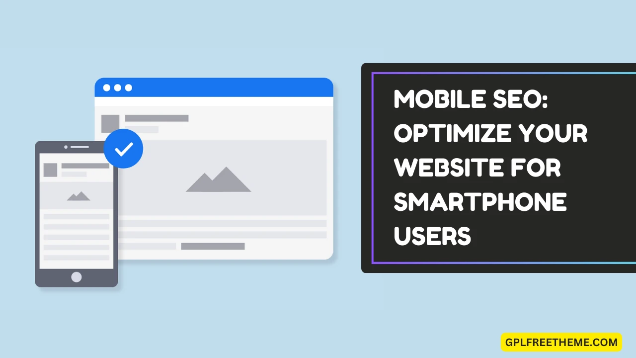
Mobile SEO is the process of optimizing your website, primarily to improve appearance and search rankings for mobile devices.
Mobile SEO optimization is important because billions of people use their mobile devices to search the web.
Did you know that the number of smartphone mobile users worldwide is expected to reach approximately 6.7 billion in 2023 and more than 7.7 billion by 2028?

According to Think with Google, more than 50% of web traffic comes from mobile. So, if your website is not optimized for mobile, you are missing out on a lot of traffic and sales.
In this free guide, you’ll discover some mobile website SEO tips and techniques that will work like a charm in 2024.
Top 8 Mobile SEO Best Practices for 2024

1. Create a Mobile-Friendly Site
Did you know that Google uses mobile-first indexing? (Source: Google Search Central)
Mobile-first indexing is enabled by default for all new websites.
Mobile-first indexing means that Google primarily uses the mobile version of a webpage for crawling and indexing instead of the desktop version.
You can check if your website is indexed mobile-first by visiting the “Mobile Usability Report” in Google Search Console. If your website is indexed mobile-first, your pages will appear as “usable pages.”
Here’s what it looks like;

Another simple way is to use Google’s Mobile-Friendly Test tool. This tool allows you to test how easily a visitor can use your page on a mobile device.
You just need to enter a URL to see how your page scores.
Have a look;

As you can see, the tool will display a message that reads, “Page is mobile-friendly” (if your site is mobile-friendly).
So, create a mobile-friendly website, if you haven’t already.
The simplest and most effective way to make a WordPress site responsive is to use a mobile-friendly theme. Regarding mobile-friendly themes, there are a lot of options out there, like;
- GeneratePress
- Astra
- Elegant Themes
The above-mentioned WordPress themes are extremely affordable and come with a mobile-responsive design out of the box.
2. Make Use of Mobile SEO Plugins
Use the self-hosted WordPress platform for your website if you aren’t using it yet.
WordPress is the world’s most powerful CMS (Content Management System). The best part? It offers tons of mobile SEO plugins that can help you optimize better. Here are some useful mobile SEO plugins that you can use in 2024.

WPTouch: This is an essential plugin that helps you create a fully mobile responsive website. It can convert content on the same URL as your regular theme.
You can also control your menus, pages, devices, etc. It offers a wide range of themes that is up to 5 times faster than desktop or responsive themes. There is also a free version if you just want basic features.
Smush: This is an image optimization plugin in WordPress. Smush is an essential tool if you’re using multiple images on your website. This plugin offers many useful features like image resizing, auto-optimize, bulk smush to optimize multiple images at once, image lazy loading, and more.
WP Mobile Menu: If you want WordPress responsive mobile menus, use this plugin. It gives your mobile visitors easy access to your website content and works flawlessly on any device including smartphones, tablets or desktops.
Most websites use intrusive popups to increase their sales or build email lists.
But, if you want to provide smartphone users with the best experience on your website, stop using popups.
Why? Popups on a website are not useful to users, as the content is not readily available for use.
Using popups can actually hurt your mobile search rankings, according to Google.

As you can see above, Google has been penalizing websites that use “intrusive popups” for years.
So, if you want better mobile SEO optimization, don’t hide your page’s content behind an ad.
If you still want to use popups for conversions, you can use the following less intrusive alternatives.
- Use Hello bars: Hello bars are sticky bars that appear at the top or bottom of a website. They are less intrusive than popups because they don’t block users’ view of the content they’re trying to see.
- Use Slide-ins: Slide-ins are similar to hello bars, but they appear from the side of the screen instead of the top or bottom.
- Use Embedded Forms: Embedded forms can be placed anywhere on a website, such as within a blog post or product page. If you want to collect email addresses, these are better than popups.
- Use Exit-intent popups: Exit-intent popups are popups that appear when a user is about to leave your website. Make sure to use them only on specific pages; otherwise, you’ll be annoying smartphone users.
4. Optimize your Titles and Meta Descriptions
When mobile visitors search for your website on Google, the first thing they see is your title and meta description.
They are also one of the most important factors in determining whether someone clicks on your link or not.

To optimize your titles and meta descriptions, make sure they are:
- Clear and concise: People should be able to understand what your web page is about from the title alone.
- Keyword-rich: Try to include your target keywords in your titles and meta descriptions, but don’t overdo it.
- Compelling: Use strong verbs and persuasive language to make people want to click on your link.
Here are some more tips for optimizing your titles and meta descriptions:
- Use similar intent keywords in your title tag and meta description.
- Keep your titles under 60 characters and your meta descriptions under 160 characters.
- Use questions in your meta descriptions, as they create curiosity.
5. Optimize for Local Mobile SEO
If you operate a local business or small business, you need to optimize for mobile.
Local SEO is extremely important for mobile optimization. Why? Because more and more people are using their mobile devices to search for local businesses.
According to Google, more than half of searches are now done on mobile devices.
So, what’s the best way to leverage local mobile SEO to generate more traffic and sales?
Target geo-specific keywords.
You should use local keywords in your website content. You should find and use geo-specific keywords, which are keywords that focus on location.
Here are some examples of geo-specific keywords:
- “Pizza delivery near me”
- “Plumber in San Francisco”
- “Hair salon in Los Angeles”
- “Car dealership in New York”
- “Coffee shop in Seattle”
You can use a keyword research tool like Semrush to find geo-specific keywords.
Have a look at an example keyword;

As you can see above, the SEMrush keyword tool suggests over 300 geo-targeted keywords, for example the keyword “new york marketing agency.”
Similarly, you can choose any local keyword phrase, and SEMrush will suggest hundreds of geo-targeted keywords.
Once you have identified geo-specific keywords, include them in your website’s title, meta description, header tags, and body text.
Here are some more tips for targeting geo-specific keywords:
- Use long-tail keywords even when you’re targeting geo-specific keywords. Long-tail keywords are more specific and less competitive. This means they are more likely to rank well in local search results.
- Use location-specific modifiers. You can use location-specific modifiers like “near me,” “in [city],” or “in [state]” to make your keywords more geo-specific.
- Analyze your competitors to see what local keywords they’re already ranking for. Make sure they’re relevant to your business so you can drive relevant traffic from Google.
6. Optimize “Above the Fold”
Users see “above the fold” on the first scroll.
Being above the fold is extremely important on smartphones because it’s the first thing visitors see when they land on your page.
Did you know that people who are visiting your website from their mobile devices are more likely to bounce from your website if they don’t see what they’re looking for?
Therefore, it is important to make a good impression.
Use strong visuals, such as high-quality images and attractive calls to action above the fold.
Here are some best practices for smartphone users to optimize above the fold;
- Use a clear and concise headline. Regardless of your website, your headline should be the first thing users see. So, spend quality time crafting your homepage titles or blog post titles. Avoid using all caps, as this can make your headline difficult to read.
- Use a large font size. Smartphone screens are smaller than desktop screens, so make sure your font size is large enough to be readable. A good rule of thumb is to use a font size of at least 16px.
- Use plenty of white space. White space is the empty space around your text and images. It can make your content more readable and visually appealing.
- Don’t clutter your above-the-fold content with too much text and images.
7. Research Keywords for Voice Search
Did you know that 52% of people use voice search while driving? (Social Media Today).
Additionally, 65% of 25-49 year olds talk to their voice-enabled devices every day (PwC)
Voice search is the next big thing in mobile SEO.
So, if you want to get more traffic and better results from mobile optimization, make sure to optimize your website for voice searches.
If you don’t know, voice search is a way of using your voice to find information online. Instead of typing a search query into Google Search, you simply say your question.
There are a wide range of voice search assistants that people use such as iPhone’s Siri, Alexa, etc.

Some examples of voice search:
- “Find me the nearest coffee shop.”
- “What is the weather forecast for tomorrow?”
- “Define the word ‘SEO.’”
- “Set a timer for 10 minutes.”
Voice search SEO is the process of optimizing your website for voice assistants like Google Assistant, Microsoft Cortana, Apple Siri, etc. So, how to optimize your website for voice search? Here are some voice search best practices.
Find long-tail keywords: Long-tail keywords are more specific and less competitive than short-tail keywords. For example, “SEMrush SEO tool free trial” is a 5-word long-tail keyword, which is less competitive than a short-tail keyword like “SEMrush trial”.
Plus, long-tail keywords are more likely to be used by people who are closer to making a purchasing decision. So, if you want better conversions and targeted traffic to your website from smartphones, use long-tail keywords.
You can use Google Autosuggest, Semirush, Ubersuggest, etc. to find long-tail keyword phrases in your niche.
Target question-based keywords: Question-based keywords are keywords that start with a question word, such as “what,” “how,” or “why.” These are often used by smartphone users who are using voice assistants like Siri, Alexa, etc.
Use conversation keywords: To target question-based keywords, you can use the following tips:
- Use Google’s People Also Ask box. When you search for a keyword in Google, scroll down to the “People Also Ask” box, which contains a list of related questions that are often asked by other users.
- Use keyword research tools like Semrush Keyword Magic, as it helps you to find question-based keywords. Simply enter a seed keyword, and the Semrush will generate a list of related keywords, including question-based keywords.
- Consider the types of questions your target audience will likely be asking.
Optimize your content using natural language: Last but not least: you need to optimize your voice searches with natural language. Use simple words in your content. Try to include phrases that people frequently use when talking to their voice assistants like Siri or Alexa.
8. Improve Core Web Vitals
Core Web Vitals (CWV) are speed metrics that Google uses to understand how users experience a web page. It simply measures the speed, responsiveness, and visual stability of websites.
The better your website’s CWV score, the better your search performance.
SEMrush is one of the best tools that helps you identify the CWV score of your website.
You can use SEMrush’s Site Audit tool to find the main Web Importance score.
Here’s what it looks like;

As you can see, our site has a decent score of 90% out of 100.
The best part? The tool also gives you suggestions when you scroll down a bit.
Have a look;

See that? You’ll get a breakdown of pages by their status for each Core Web Vitals metric, plus optimization tips.
So, Semrush is an essential tool for anyone who wants to improve their Core Web Vitals.
Here are a few quick tips for improving CWV scores;
Optimize LCP Element:
- Reduce background image size: Large background images can significantly impact LCP. Consider optimizing their size or using smaller alternatives.
- Utilize WebP format: WebP offers superior lossless image compression, reducing file size without sacrificing quality. Preload important WebP images for faster rendering.
Optimize CSS + JavaScript:
- Minify CSS and JavaScript: Tools like CSS Minifier automatically compress these assets, reducing their size and improving load times.
- Defer non-critical JavaScript: Defer non-essential JavaScript files to load after the initial page content, ensuring faster LCP.
- Reduce third-party script usage: Minimize the number of external scripts loaded on your website, as each script adds an additional HTTP request and slows down loading.
Optimize Third-Party Code:
- Host fonts and analytics locally: Hosting fonts and analytics code on your own server eliminates the need for external requests, improving LCP.
- Utilize asynchronous loading: Implement asynchronous loading for external scripts to prevent them from blocking the rendering of critical page content.
WebP Image Format:
- Use WebP for all images: WebP offers superior compression, leading to smaller file sizes and faster loading times. Consider leveraging plugins or tools to convert existing images to WebP format.
In case you’re curious, Semrush offers the following three pricing plans.
- Pro plan costs $119.95 per month, where you can add up to 5 projects, 500 keywords to track, and 10,000 results per report.
- Guru plan costs $229.95 per month, where you can add up to 15 projects, 1500 keywords to track, and 30,000 results per report.
- Business plan costs $449.95 per month, where you can add up to 40 projects, 5000 keywords to track, and 50,000 results per report.
Want to try it out for free? You can use the following link to try Semrush FREE for next 14 days.
Grab 14 Days Free Trial of Semrush
Try the SEMrush account and if you don’t like it, you can cancel it before the trial ends. If not, they also offer a 7-day money-back guarantee, so you have nothing to lose.
A Quick Checklist for Mobile Website SEO
This checklist provides essential actions to optimize your website for mobile users and search engines:
Responsiveness:
- Use a mobile-friendly theme: Consider responsive themes like GeneratePress or Astra for WordPress users to ensure your website automatically adjusts to any device.
- Test across devices: Verify how your website appears and functions on various devices using tools like BrowserStack.
Speed:
- Optimize website speed: Employ techniques like minification, database compression, GZIP compression, and image optimization.
- Utilize Google’s PageSpeed Insights: Identify areas for improvement and implement strategies for faster loading times on mobile devices.
Content:
- Prioritize mobile-first indexing: Ensure Google prioritizes your mobile content for search results.
- Optimize for readability: Use clear formatting with shorter paragraphs, larger fonts, and ample images for enhanced readability on mobile screens.
- Consider text-to-speech: Implement text-to-speech functionality for users who prefer listening to content or have reading difficulties.
- Target local keywords: Optimize for location-based keywords if your business caters to a specific area.
User Experience:
- Avoid intrusive elements: Minimize popups, excessive JavaScript files, and elements that hinder user experience or slow down mobile browsing.
- Simplify navigation: Ensure menus and buttons are easily accessible and optimized for touch interactions.
FAQs on Mobile SEO Strategy
Q: How do I know if my website is mobile-friendly?
A: You can use a free tool like Google’s Mobile-Friendly Test to check your website’s mobile responsiveness across different devices. If your website isn’t mobile-friendly, consider using a mobile-responsive theme or consult a web developer for assistance.
Q: What is mobile SEO?
A: Mobile SEO is the practice of optimizing your website for users browsing online on smartphones and tablets. This involves ensuring your website renders correctly, loads quickly, and offers a smooth user experience on mobile devices.
Q: Why is mobile SEO important?
A: According to Google, more than half of all searches now originate from mobile devices. This means a significant portion of your potential audience is searching for information on the go. Failing to optimize your website for mobile can lead to missed opportunities for website traffic, leads, and sales. Mobile optimization can directly contribute to increased sales and traffic for your business.
Q: How can I improve my mobile SEO?
A: Here are some key strategies for improving your mobile SEO:
- Adopt a responsive design: This ensures your website automatically adjusts its layout and content to fit any device screen size, minimizing the need for zooming or scrolling.
- Optimize for speed: Mobile users have limited patience for slow loading websites. Use a Content Delivery Network (CDN), optimize images, and implement caching mechanisms to improve website speed.
- Target question keywords: Consider the rise of voice search and incorporate relevant question-based keywords into your content to attract users searching for information on the go.
- Prioritize mobile-specific content: Focus on creating mobile-friendly content formats like short videos, bite-sized text, and interactive elements for enhanced user engagement.
- Optimize local SEO: Ensure your website displays accurate contact information and local business listings for optimal local search visibility.
Q: How is mobile SEO different from desktop SEO?
A: While both forms of SEO share common principles like keyword research and content optimization, mobile SEO has a distinct focus on:
- Mobile-friendliness: Ensuring website content and functionality adapt seamlessly to smaller screen sizes and touch interactions.
- Faster loading times: Mobile users have limited data and patience, requiring website content to load quickly and efficiently.
- Simplified navigation: Design intuitive and easily accessible navigation menus for optimal user experience on mobile devices.
- Voice search optimization: Targeting relevant question-based keywords to attract users searching through voice commands.
By understanding these key differences and implementing effective mobile SEO strategies, you can ensure your website reaches a wider audience and thrives in the mobile-first world.
Final thoughts on SEO for mobile devices
Be sure to test your website on different mobile devices to see if it looks good on everyone.
Page loading time is one of the important elements of mobile SEO optimization, so use a CDN, enable caching, and switch to a fast web host.
What are your thoughts on SEO for mobile devices? Do you have a mobile SEO strategy? have any questions? Tell us in the comments.