
Creating a website that stands out requires more than just a good idea. This demands a strong understanding of basic web design principles. These principles are the cornerstone of creating a website that not only looks great but also provides an exceptional user experience (UX).
This article highlights these principles, offering practical advice on how to integrate them into your site to increase functionality, aesthetic appeal, and overall performance.
12 Web Design Principles
Creating a functional and visually appealing website depends on solid design principles and the use of the right tools.
With Hostinger Website Builder, you can easily apply these design principles to create a professional and effective online presence, even if you’re new to web design.
1. Simplicity and Clarity
Simplicity in web design is about avoiding the unnecessary and focusing on the essential.
A clean site design, straightforward navigation and easily digestible content allows visitors to quickly find what they’re looking for.
With its clean layout and intuitive navigation bar, Apple’s website is a testament to the power of simplicity.

Stripe follows suit, using ample white space and clear directives to engage users.

Creating a simple and clear website is easy with the Hostinger website builder. Its clean templates and drag-and-drop interface help simplify the website design process.
2. Visual Hierarchy
Giving equal importance to each element creates a web page where nothing stands out.
The principle of visual hierarchy in web design focuses on organizing visual elements that naturally attract the viewer’s attention.
It’s about creating a focal point and guiding the user’s eye through the content in a logical, intuitive way. This ensures that website visitors see the most important information first.
Let us consider the implications of this principle with two examples.
Poor example of visual hierarchy

Here’s a website that ignores the visual hierarchy principle. We see a web layout without a clear focal point, where all design elements are competing with each other for attention.
The lack of negative space, combined with the use of similar font sizes and colors across different types of content – headings, subtitles and body text – creates a sense of uniformity. This may cause confusion among website visitors.
Additionally, the call-to-action button blends into the background without being particularly prominent, potentially reducing user engagement.
Good Example of Visual Hierarchy

Let’s take a look at one of the Hostinger website builder templates, which is designed to follow best visual hierarchy practices.
The author’s name is the dominant element on the page, immediately attracting attention and establishing identity. The title Creative Copywriter is positioned as a secondary focal point, providing clarity and supporting the main title without competing with it.
The layout is thoughtfully organized, taking website visitors through an introduction, followed by a portfolio showcase. The use of negative space around text and images creates a clean look that enhances readability and UX design.
Finally, the My Projects button is a clear call to action that encourages engagement.
3. Mobile Responsiveness
With mobile users becoming more widespread, building mobile-friendly websites has become a top priority. Mobile-responsive design ensures that your website adapts to different screen sizes, providing a seamless experience across all devices.
The key is to adopt a mobile-first philosophy, which prioritizes the mobile experience with every design choice.
To implement mobile responsive web design principles, a website designer can use two key techniques:
Media Queries
Media queries are a CSS feature that enables your website to apply different styling rules depending on the device’s screen size. This maintains the functionality and aesthetics of your website, whether it is viewed on a small mobile device or a large desktop monitor.
Flexible Layouts
Flexible layouts use relative units like percentages rather than fixed units like pixels.
This approach allows your content to dynamically adjust and fit the screens of different mobile devices, ensuring a consistent and accessible user experience.
The Hostinger website builder is designed with mobile responsiveness in mind, helping users create websites that look great and work well on all devices without the need for technical expertise.

4. Accessibility
Web accessibility refers to the practice of making websites more inclusive for people with disabilities. This essential principle ensures that everyone can access, understand, and navigate your website effectively.
Making your website accessible not only enhances user experience and SEO but also ensures legal compliance. More importantly, it shows your commitment to social responsibility and equal access.
True inclusivity can be achieved by implementing the ARIA (Accessible Rich Internet Applications) specification. It defines special markup that can be added to HTML tags, helping assistive technologies such as screen readers understand and interact with web content.
Here are some tips for implementing accessibility into website design:
- Add descriptive alt text for images – this helps screen readers convey the content of images to visually impaired users.
- Apply contrasting colors – choosing complementary colors for your web elements and their backgrounds can make your content more readable for users who are colorblind.
- Keyboard navigation – ensure that your website can be navigated using a keyboard alone, catering to users who cannot use a mouse.
- Deliver multimedia accessibility – offer transcripts for audio and captions for videos to make your multimedia content accessible to screen readers.
- Offer clear website navigation – consistent and predictable navigation helps users with cognitive disabilities to understand and navigate your site.
- Use accessibility checkers – test your website’s accessibility with tools like WAVE (Web Accessibility Evaluation Tool).

5. Loading Speed
The loading speed of a website is a critical factor in UX design. Slow-loading web pages can lead to increased bounce rates, as users often lose patience and leave the site. Fast-loading websites improve user satisfaction, increase engagement, and are favored by search engines.
Image size, server response time, and efficient coding are some of the main factors that significantly impact website speed. Here are some tips for optimizing the site load time:
- Optimize images – reduce image file sizes without sacrificing quality to lower the amount of data that needs to be loaded when a new user visits your site.
- Minimize code – minify CSS, JavaScript, and HTML to remove unnecessary characters, comments, and whitespace.
- Use efficient coding practices – optimize your code by using efficient algorithms and avoiding redundant or unnecessary scripts.
- Leverage browser caching – store frequently accessed resources in the user’s browser to speed up subsequent page loads.
- Optimize CSS and JavaScript loading – to improve load times, prioritize loading essential styles and scripts first over non-critical resources.
- Choose a quality web host – choose a reliable web host that provides fast server response times, efficient data retrieval, and robust bandwidth to handle high traffic.
Hostinger’s web hosting plans include features that help optimize website speed:
- Solid-State Drives (SSD) – they enable faster data retrieval compared to traditional hard drives.
- Optimized servers – Hostinger servers are optimized for content management systems like WordPress, ensuring faster loading times.
- Free CDN – Hostinger’s CDN reduces the time a website takes to fetch resources, addressing user requests more efficiently.
- Latest technologies – all our hosting plans leverage LiteSpeed web servers and object cache for rapid site loading.
- Unlimited bandwidth – our plans do not limit the amount of visitors to your site, helping you accommodate high traffic volumes effortlessly.
- Website speed test tools – Hostinger offers a suite of website speed test tools to simplify your site optimization efforts.

Usability tests are crucial for checking your site’s loading speed. Utilize tools like Google PageSpeed Insights, GTmetrix, and Pingdom to diagnose and optimize specific areas of your website that may be causing delays.
6. User-Centered Design
User-centered design (UCD) places the user at the center of the design process. This approach ensures an attractive and user-friendly product by prioritizing the user’s needs, preferences and limitations.
An effective way to implement UCD is to develop user personas and usability testing.
User personas are fictional characters created based on your target audience. They help designers and developers understand the needs, goals, and behavioral patterns of their users.
Meanwhile, usability testing is a website design practice that involves watching real users interact with your website to identify usability issues. This direct feedback is important for making user-centric improvements.
For example, Airbnb’s commitment to user experience has played a key role in the growth of its business. The company enhances its service and user interface as per the feedback and behavior of the customers. This focus on user-centric web design has resulted in increased bookings and overall user satisfaction.

Hostinger Website Builder’s intuitive design features can help you effectively apply UCD to your site. Our selection of pre-designed templates and customization options make it easy for you to adjust your website to meet specific user needs.
7. Content Quality
Publishing engaging, relevant, and SEO-friendly content can help attract and retain visitors, as well as establish your website as a trusted source in your field.
Implementing content with compelling visual design helps you provide a better user experience. High-quality images, infographics, and videos can break text into separate sections. They can also help you explain points effectively and make complex topics more digestible.
Here are some effective content creation and curation tips:
- Understand your audience – tailor your content to the interests, needs, and problems of your target audience.
- Be consistent – maintain a consistent voice and style that reflects your brand’s personality.
- Use SEO best practices – incorporate relevant keywords naturally to improve search engine visibility.
- Quality over quantity – focus on creating valuable content rather than just churning out large quantities.
- Update regularly – keep your content fresh and up-to-date to maintain relevance and engagement.
- Visual balance – use high-quality visuals alongside your written content to give your viewers a balanced reading experience.
- Engage and interact – encourage user interaction through comments, forums, or social media to build a community around your content.
8. Color Psychology
It is important to understand color psychology in a web design project to create an effective and cohesive online presence. Your website’s color scheme is more than just an aesthetic choice. It sets the foundation for your brand identity and plays a key role in how users interact with your site.
Businesses choose their brand colors based on the emotions they want to evoke in their customers. For example:
- Blue – builds trust, security, and professionalism. Commonly used in corporate and financial websites.
- Red – evokes excitement, passion, or urgency. Frequently used for call-to-action buttons or sale announcements.
- Green – represents growth, harmony, and environmental consciousness. Ideal for health, wellness, and eco-friendly brands.
- Yellow – conveys optimism and happiness. Used to grab attention or highlight important elements.
- Purple – symbolizes luxury, creativity, and spirituality. Popular among beauty and wellness brands.
Understanding these associations can help you select a color palette that not only looks good but also aligns with the message and emotions you want to convey.
Here are some examples of brands using effective color psychology:
- Dropbox – uses a soothing blue palette, reinforcing its message of secure and reliable cloud storage.

- Nike – often uses a combination of black, white, and red, portraying a sense of boldness and energy, fitting for a sports brand.

9. White Space and Breathing Room
White space, often called negative space, is the unmarked area between design elements that creates a streamlined look. It is an important component of website design, playing a vital role in the balance and structure of pages.
Proper use of white space can greatly improve the readability and overall aesthetic appeal of a website. It is soothing on the eyes and helps guide users through the content in a more organized manner.
Here are some website design guidelines for effective use of white space:
- Strive for balance – too much white space might make the content feel disconnected, while too little can lead to a cluttered and overwhelming design.
- Aim for uniformity – design your website with consistency by evenly spacing margins and padding around elements and the space between lines of text.
- Hierarchy – use white space to create a hierarchical viewing experience. More space around an element can signify its importance.
- Breathing room – give elements room to breathe. This is especially important for key areas like navigation menus, headers, and call-to-action sections.
- Account for different browser windows – ensure that your white space adapts well to different screen sizes to maintain a clean and accessible layout across devices.
10. Typography and Readability
It’s important to select readable fonts that reflect your website’s visual style. They should be aesthetically pleasing but still easy to read.
Here are some tips for selecting fonts and maintaining readability:
- Choose web-safe fonts – widely supported fonts ensure consistency across browsers and devices. We recommend sans serif fonts like Arial or Helvetica for online content due to their clarity and simplicity.
- Limit font varieties – using too many fonts can make your website look disjointed. Stick to a maximum of two or three fonts for a cohesive design.
- Define font sizes – appropriate font sizes are crucial for readability. Small text can strain the eyes, while overtly large text can disrupt the flow of reading. When considering varying sizes for headings and body text, it’s important to find a balance.
- Consider line length and spacing – the ideal line length for text is typically between 50-60 characters. Adequate line spacing – also known as leading – improves readability.
- Mobile responsive typography – ensure that your typography adapts to different screen sizes. This usually involves adjusting font sizes and line spacing for mobile devices.
- Hierarchy and emphasis – use different font weights and styles to create a hierarchy and draw attention to key sections of your content.
11. Interactive and Engaging Elements
Interactive elements can significantly improve user engagement, retention, and conversion rates when done right.
Key interactive features include buttons, forms, and micro-interactions:
- Buttons – essential for guiding users towards desired actions, such as signing up or making a purchase. To be effective, buttons should stand out visually and be placed strategically.
- Forms – crucial for gathering information. A well-designed website form should be simple, clear, and short.
- Micro-interactions – subtle animations or changes – like changing the color of a button when a mouse hovers over it – add a dynamic layer to your site. These small visual responses can enhance the interactive experience.
Here are a couple of website examples that effectively use interactive elements:
- Stripe – Its website features interactive elements such as animated backgrounds and dynamic graphics that react to cursor movements, making the browsing experience more engaging.

- Trello – Trello’s website showcases its product through interactive demonstrations. Users can click and drag information cards onto the sample board to learn about the tool, making the interface both informative and engaging.

12. Cross-Browser Compatibility
To reach a wide audience, your website must look and work as intended on a variety of browsers, including Chrome, Firefox, and Safari.
However, different browsers interpret website code in their own ways, which can lead to variations in appearance and functionality. Ensuring consistency can be a challenge, especially with every new browser update.
Here are some tips for testing cross-browser compatibility:
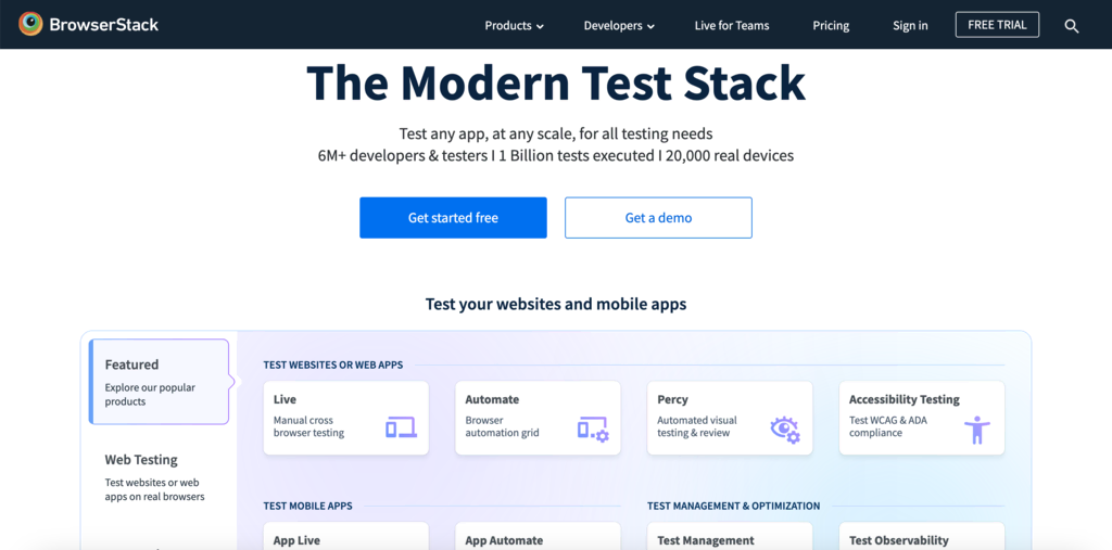
- Use testing tools – tools like BrowserStack or CrossBrowserTesting lets you check how your site performs on different browsers.
- Implement regular updates – make sure your website code is up-to-date and tested on the latest browser versions.
- Prioritize mobile responsiveness – your site must be able to adapt to various screen sizes and resolutions.
The Hostinger website builder is designed with cross-browser compatibility in mind, so websites created using it work flawlessly on different browsers. This saves you the hassle of additional testing and changes, allowing you to focus on other aspects of your website.
Conclusion
This article highlights the basic principles of web design that can transform your website into a functional, aesthetically pleasing and engaging online presence.
For new website owners, we recommend starting with these website design principles:
- Simplicity and clarity – aim for a straightforward design with user-friendly navigation. A clear and uncluttered layout helps visitors find what they need quickly and easily.
- Mobile responsiveness – ensure your site adapts to all device screens, from desktops to smartphones.
- Loading speed – optimize your site for fast loading times to keep visitors engaged and improve overall user experience.
- Content quality – publish relevant, informative, and helpful content to capture visitor interest and establish your site’s credibility.
These web design principles are easy to implement with Hostinger’s website builder. Its intuitive interface and versatile templates make it easy to create a website that is both functional and user-friendly.
Web Design Principles FAQ
Let’s address some common questions about website design principles.
What Are the Basic Principles of Web Design?
Some essential principles of website design include simplicity, mobile responsiveness, content quality, and visual hierarchy. These principles aim to create user-friendly websites that work well on all devices and browsers while ensuring easy navigation and wide accessibility.
How Do I Apply Web Design Principles to My Website?
To apply web design principles, choose a clean layout, clear navigation, and ensure content is accessible on different screen sizes. Then, ensure readability and visual appeal of elements through color and typography. Finally, constantly test and update your website based on performance data and user feedback.